I have finally decided on a color scheme for the living room and dining area. For the walls, I have chosen Rosemary Green from Benjamin Moore and red as the accent color. I have loved these two colors together for the longest time, but have found very little use of them together. I was nervous about pairing them together, but after watching Color Splash, I know that they will work great together because they are opposite on the color wheel. I think David would be proud of me!
 Benjamin Moore has a great tool for choosing the right colors and seeing your visions on the walls. I just wish they would let you change the decor so you can really see how well the colors would work together.
  Our dining area is going to look very similar to this one. We will have built-in bench seating on one side and chairs on the other sides. The color scheme will be the same as in the living room since the rooms are open to one another. I can totally picture a table just like this one in that space. How cute is the chalk board paint on top of it?! How fun for the kids…and us. I can already see lots of plumbing diagrams and sewing ideas being drawn on top.
 We would like to make a sliding door similar to this one for the playroom. With the playroom being so small and the dining area being so close to the playroom we don’t have a lot of space for a swinging door, nor do we want to compromise the space on either side of the door for it to swing. I have seen these door used a few places and just love them.
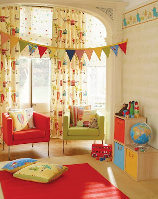
  And after seeing this playroom I was in LOVE! Granted our playroom is going to be about 500X smaller then this one, but the color scheme is exactly what we will be using, especially since I already have these colors throughout our house and this would be a great way to tie them all in. Plus the kids kitchen set and storage containers are already in this color scheme. LOVE!
 The only space we are still unsure about is the bedroom upstairs.
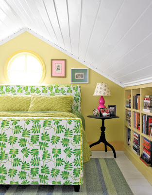
 We are not sure if we should do something like these built into the walls.
  Because we have very limited areas for storage and have a major lack of closets in this house. So we need to utilize any and every space we can.
 source (House of Turquoise)
 source (Urban Grace Interiors)
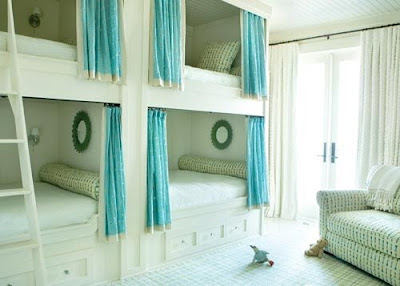
 But I am also in love with the idea of building the girls beds into the walls and utilizing that space in such a great and unique way. Of course we would only be able to put their beds down low on both sides of the room and not like shown above. So I guess our biggest question is whether we make the room for us or for the girls. Thankfully we have some more time to sleep on it.
I have found so much inspiration on the web and thought I would share my favorite sites with all of you. Plus this is a great way to keep them all in one spot as a reference point for me. I love being able to have all of these great ideas in one spot and to be able to show the hubby “my plans” and hopefully we can make our plans work together.
Designspiration [sk]


I love it ALL!! Are you seriously going to do the chalkboard paint on the table, because you will be my hero if you do!! That would be awesome!
And I love that sliding door! And the green you chose for the walls! Heck, I love it all, literally!! Can't wait to see it all come together!!
My first thought seeing those colors together is "CHRISTMAS" – I think it might be challenging to put red and green like that together without it seeming like a Christmas themed room. But maybe I need to watch the Color Splash episode you did. Please show us your finished room when you are done!
whats wrong with a Christmas room?! no really, i should have mentioned that there will be a ton of white trim, curtains and shelving to go along with it all. the red is just going to be accents and maybe a couch. thanks for being honest, i love to see what others think. i will definately show the finished project and yes you should see color splash…lots of eye candy:)
I am pretty sure I am in love with all your inspiration choices! So beautiful!
I know what you mean about not seeing those colors together in a "design" sense, but I always like to point back to nature when I'm looking at color. When I look at a bright red tomato hanging on a green vine, I never think "now, those two shades really don't work". I can't wait to see what you do! Right now I'm loving aqua and kelly green together. It's an odd idea in concept, but it totally works! For me at least!
Well I definitely liked reading it. This tip procured by you is very effective for correct planning.
Only wanna tell that this is very useful , Thanks for taking your time to write this.